You have to choose the right images, colors, typography, etc. Also, know about whitespace, hierarchy, and design theory in general. Also, there are many design resources that will help you and make your work easier. In this article, I will discuss the important points and steps to create a beautiful hero section and these methods apply to design in general too. So, get ready, and let’s start.
Hero Needs A Structure
Like everything, a hero needs a structure and a good one. You can’t throw things into it. It must be built the right way. There should be columns, rows. Text and images must be separate and don’t oversaturate. The hero can have a column layout or it can be centered. For example, on the left side there can be text and some kind of button, and on the right side, image, or vector graphics. Or it can be centered where text and button are in the center. It can have an image or a video background, or just a color. Depending on the website, it can have a different structure. Online stores, app landing pages, a corporate website can have a column-based structure, and blogs and simple sites can have centered design. More creative or portfolio websites can have a more complex design, but remember that it should be simple and easy to understand.
Typography
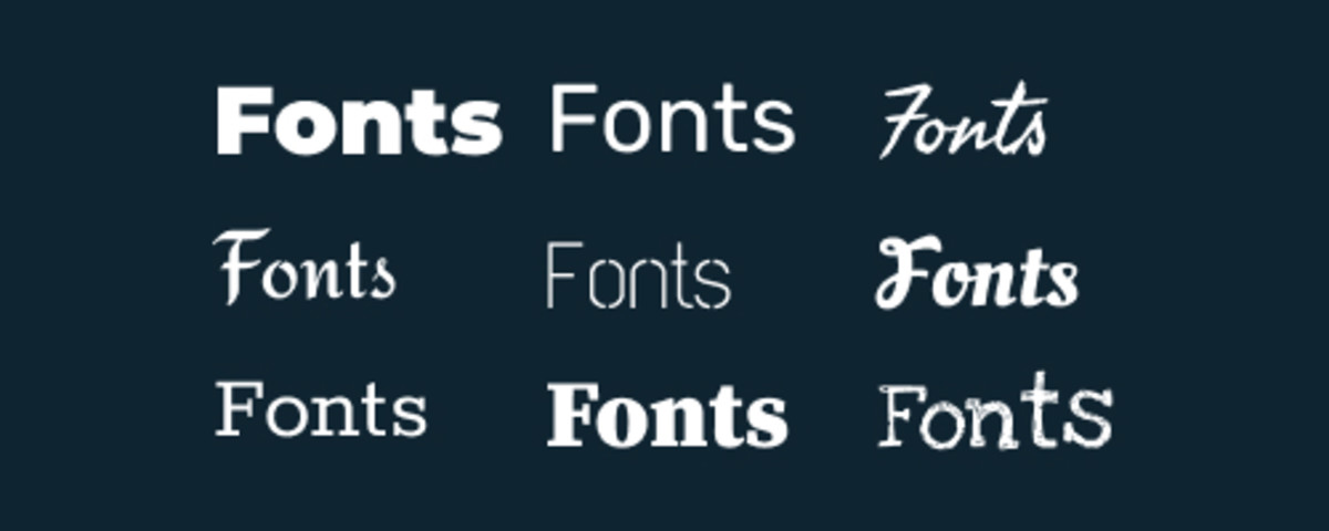
Another important thing in hero design is typography. It is very important to choose modern fonts that are beautiful. Don’ choose old fonts. It will be bad for design. You have many free tools to find awesome fonts like Google Fonts. You can have serif, sans serif, display, or any other font styles. And it must fit a design. For example, if you have a classy website, don’t choose cartoonish fonts. You get the idea. Also, there can be a pair of fonts. Two fonts that work well together. But be careful, not all the fonts work well in pairs. Font pairs are great for heading and paragraph. Heading or title can be one font, and the paragraph can be another font. Also, titles should be bolder and bigger than small texts. It is great for hierarchy. Also, consider whitespace. Whitespace is a gap between paragraphs and titles.
Colors Matter
Yes. In design, colors really matter. It can beautify your hero or just completely ruin it. So choose wisely. Beginner designers don’t use colors well and they don’t use tools like color wheels or palette generators. They are a great help. And it is not a must to choose many colors. You can choose 2 or 3 colors and create beautiful designs. One-color can be the main and the other two colors can be accent colors. Do not saturate a hero section with too much color, because you will have some kind of image or vector that has its color. So, use colors wisely and make sure it fits the design.
Use Beautiful Images
Images are very important in every website. And it is important in hero sections too. Every hero section needs images whether it be background or an element. And you can insert regular images or graphics, or even 3D renders. But you have to use high-quality images and vectors. Because if you have a good design, good fonts, colors, but bad images, it will ruin the whole design. You shoot images by yourself or create vectors and edit in different software, or you can use tools like Unsplash to find beautiful images. You can use image combinations if you want to go more creative. Even insert some vectors, blob shapes, or other details to make it more beautiful.
Use Buttons
Using buttons is very important too. Buttons in hero sections are Call To Action (CTA). This is the button that takes visitors to another page or section. This way you can transfer visitors to a product page or sale page. It is a great way to point users to specific, important pages. Works well with eCommerce websites. Also, great for landing pages where they can immediately download the app or other products. Also, many websites use email subscriptions instead of buttons and it is also a kind of CTA. This way you collect user emails and then you can start email marketing. Or send the news to people. Both, button and email newsletter are a great way to get traffic and sell products. So, CTA is a must do.
Wrap Up
So, in order to create a beautiful and engaging hero section, you should consider these steps and build accordingly. Also, you can learn design basics which will help you a lot.


